Imagine walking down a busy street where every store's sign uses the exact same dull, 12-point Times New Roman font. Sure, the names might differ, but would any of them truly catch your eye? Probably not.
Now picture this: one brand boldly redesigns its logo using a vivid 40-point red font. Suddenly, that business stands out, grabbing your attention immediately.
That's the power of a logo.
A logo is far more than just a design. It communicates your brand’s voice, values, and personality. It's your very first impression—and you don't get a second chance at a first impression.
But even the strongest logos lose impact over time.
As design trends evolve and markets shift, a once-trailblazing logo can start to feel stale or out of touch. That's why brand refreshes are crucial for keeping companies relevant.
In this guide, DolFinContent walks you through:
In this article
- Why big brands invest in logo redesigns
- The role of simplicity and modernization
- 50 brands with logo redesigns to inspire you in 2025
- FAQs
Why Big Brands Invest in Logo Redesigns
DolFinContent recently helped reimagine brands like BluePeak Ventures and NexusFlex Tech. These redesigns weren't just cosmetic—they signaled strategic transformations.
Brands invest in logo redesigns to:
- Reignite consumer interest
- Modernize their appearance
- Reflect business evolution (like mergers, pivots, or mission changes)
- Maintain consistency across new digital-first platforms
Logo redesigns aren't vanity projects. They're strategic moves that reposition brands to thrive in an ever-changing world.
At DolFinContent, we ensure every pixel of a logo refresh connects visually, emotionally, and strategically with the brand’s broader goals.
The Role of Simplicity and Modernization in Logo Design
One major trend dominating 2025? Minimalism.
Logos today must be recognizable across a dizzying array of digital platforms—social icons, app stores, mobile ads—where complexity gets lost.
Brands are favoring:
- Flat, bold designs
- Simplified typography
- Streamlined color palettes
- More versatile scaling
Companies like Spotify, Zendesk, and Klarna have all successfully modernized without losing brand equity. At DolFinContent, we prioritize creating logos that are timeless, versatile, and powerful across every touchpoint.
50 Brands With Logo Redesigns to Inspire You in 2025
Here's a fresh list of inspiring logo redesigns that show how brands across industries are evolving their visual identities.
1. Dunkin'
Updated to drop "Donuts," modernize its look, and stay versatile for more menu offerings.
2. Uber
Simplified to a clean, bold wordmark after confusing consumers with an abstract icon.

3. Santander
Switched to a white background with clean red lettering for better digital clarity.

4. Century 21
Refreshed to a modern black-and-gold color scheme with a minimalist "C21" icon.

5. US Open
Simplified their logo for a bold, tri-color digital-first approach.

6. Animal Planet
Introduced a friendly elephant mascot and cleaner lines for global resonance.

7. Mailchimp
Kept their mascot "Freddie," but switched to a simple black-and-yellow style.
8. Google Ads
Modernized their identity to integrate with the broader Google ecosystem.
9. Comfort Hotels
Created a modern, colorful "C" symbol for wider market appeal.

10. Ogilvy
Shifted to a strong serif font while retaining brand legacy.
Keep Reading: Even More Inspiring Redesigns
11. Balmain
Elegant "B" and "P" merged into a timeless monogram.

12. The Guardian
Moved to a clean black-and-white design.

13. Slate Magazine
Opted for bold uppercase lettering with striking angles.

14. Diet Coke
Added a dramatic red stripe to refresh the classic white can.
15. Sky News
Refreshed with modern, rounded typography.
16. Toys 'R Us
Simplified color palette and iconic backward "R" updated subtly.

17. FC Barcelona
Enhanced vibrant colors and removed unnecessary text.

18. Burberry
19. American Express
Enhanced readability at every size without losing their iconic blue.

20. John Lewis
Modernized typography and added "& Partners" to emphasize inclusivity.
Even More Examples:
21. Weight Watchers ➔ WW
Simplified into a wellness-focused brand.
22. Rolling Stone
Refined their classic script to remove outdated borders.
23. Rotten Tomatoes
Modernized graphics while keeping the fun tone.

24. Pepto Bismol
Flattened their pink and yellow design for easier scalability.
25. Kijiji
Made logos simpler and bubbles more vibrant.

Continuing with New Inspirations
26. Houzz
Cleaned up their "house" icon and improved font weight.
27. Flipboard
Introduced a see-through "F" window for branding flexibility.

28. GoDaddy
Retired their quirky mascot for a streamlined brand focus.

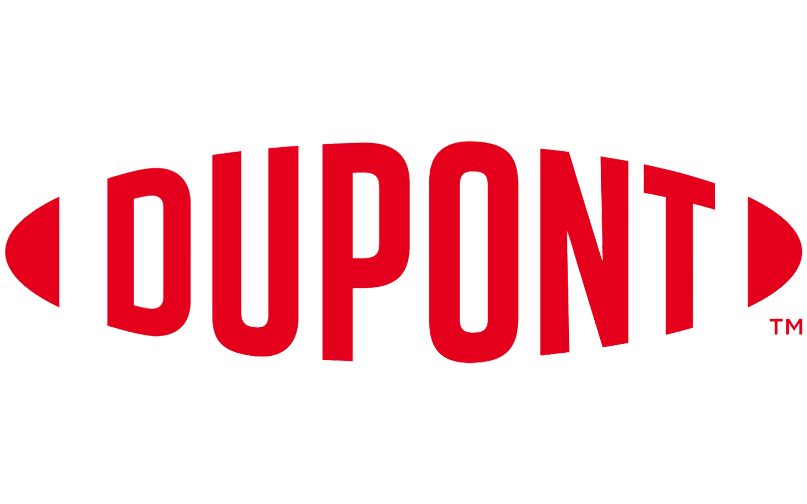
29. DuPont
Removed the enclosing oval to free their wordmark.
30. Slack
Simplified color usage and reorganized their hashtag-inspired icon.

Iconic Logo Evolutions
31. Firefox
Evolved their fox swirl into a sleek, modern abstract.

32. Nike x Undefeated
Bold collaboration refreshed with minimalistic white-on-blue design.
33. Evernote
Refined their elephant mascot for clarity.

34. Papa John's
Dropped the possessive apostrophe for a cleaner logo.

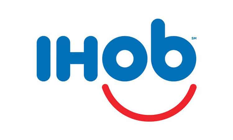
35. IHOP
Brief "IHOb" campaign created buzz before reverting smartly.
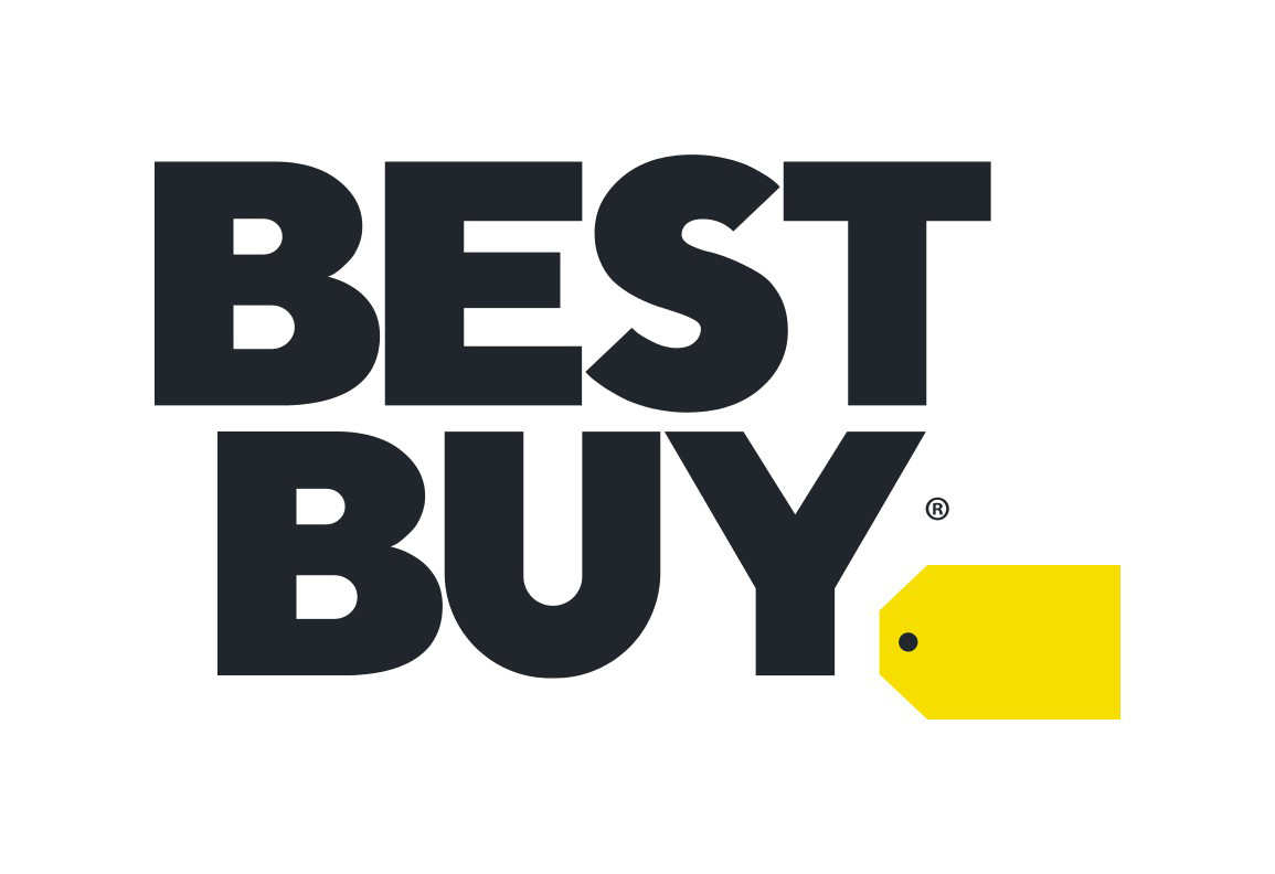
36. Best Buy
Moved their iconic yellow price tag outside the wordmark.
37. Travel Channel
Simplified palette and emphasized the "travel" aspect.

38. Rinse
Modernized with a chic gold monogram.

39. Chicago Sun-Times
Switched from a cluttered layout to a fresh, minimalistic vibe.

And Still More:
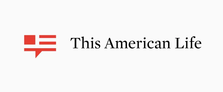
40. This American Life
Added a simple American flag symbol for social media use.
41. MAD Magazine
Modernized quirky spirit with bolder fonts.

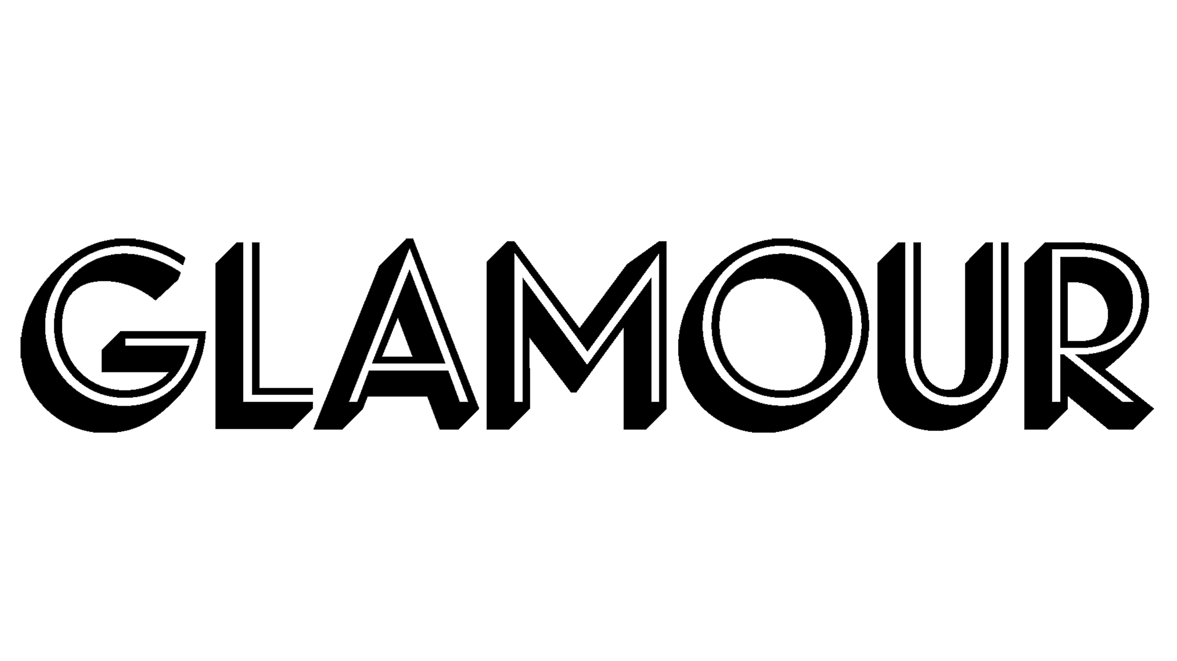
42. Glamour
Retro-chic redesign embracing Hollywood glam.
43. Ad Age
Shortened name and revived heritage typefaces.

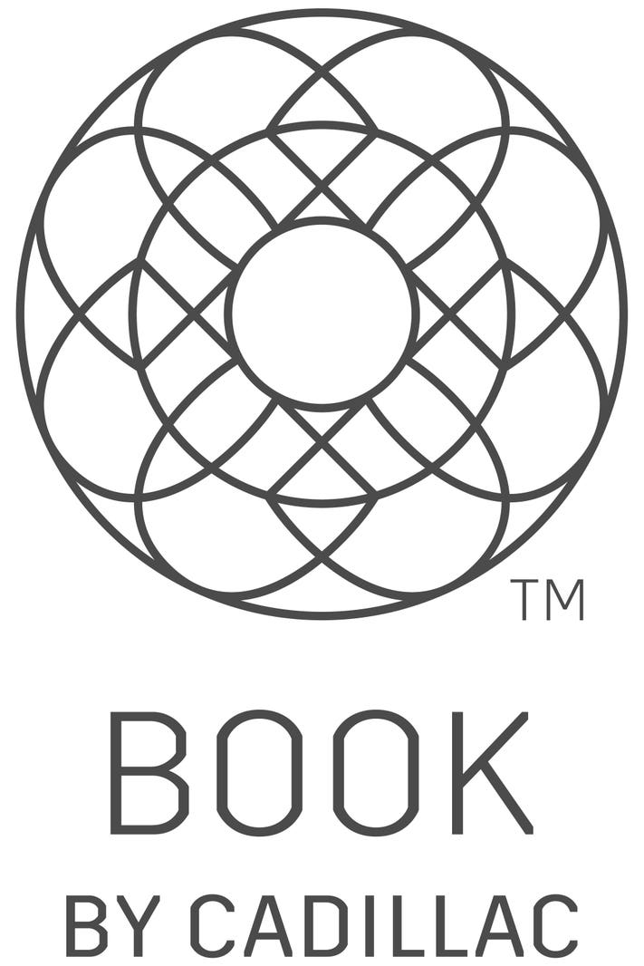
44. Book by Cadillac
Minimalist, futuristic typography for a new luxury audience.
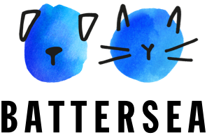
45. Battersea Dogs & Cats Home
Integrated lovable pet icons into the new design.
46. Houses of Parliament
Simplified royal gates and chains for modern screen adaptability.

47. Wahaca
Added vibrant taco icons to showcase cultural authenticity.
48. FatFace
Shifted from surfer casual to sophisticated streetwear branding.

49. Vimeo
Vimeo modernized its logo to a more geometric, cleaner font, shedding its whimsical curves to appear more professional in the competitive video hosting market.

50. Foursquare
Foursquare rebranded to better reflect its transition from a location-based social platform to an enterprise tech company, opting for a sharp, scalable new logo.

51. Zillow
Zillow updated its home icon to a more abstract, bold form to modernize its look and create stronger brand recall in mobile and web applications.

52. TGI Fridays
TGI Fridays refreshed their logo by simplifying typography and removing the iconic red stripes for a cleaner, more adaptable wordmark.
Key Takeaways for Brands
- Digital-first logo design is non-negotiable.
- Clean, adaptable logos enhance recognition.
- Simplicity does not mean boring; it means bold and focused.
DolFinContent helps companies redesign logos that don't just "look good" but strategically advance their goals. Whether you're targeting B2B, B2C, Gen Z, or enterprise buyers, we'll ensure your visual identity evolves to capture attention and drive loyalty.
Solidify Your Brand Identity with DolFinContent
Your logo is one of your most valuable brand assets. Make it work harder for you.
With DolFinContent, you'll have access to the best creative minds and AI-powered resources needed to craft logos that define industries and inspire audiences.
Ready to future-proof your brand?


.png)
.png)
.png)


