


Our inboxes are a whirlwind of notifications, newsletters, password resets, and promotional blurbs.
With so much clutter, it’s tempting to hit “select all” → “delete.”
But don’t be fooled—email remains one of the most powerful marketing tools around.
The secret?
Great design.
At DolFinContent, we know that without bold, strategic visuals, even the smartest email strategy can get lost in the inbox abyss.
In this guide, we break down the essential elements of effective email design, then showcase 31 striking examples that prove email is still a visual playground with sky-high potential.
In This Article
- What Makes an Email Visually Effective
- 31 Outstanding Email Design Examples
- Newsletter Email Design Samples
- Responsive and Lead-Nurturing Designs
- Event Promo Templates
- Versatile, Creative Campaigns
What Makes an Email Visually Effective?
1. Strong Visual Hierarchy
From photos and textures to gifs, color blocks, and illustrations—great emails tell a visual story.
Clean layouts, consistent imagery, and strategically placed CTAs can lift click-through rates by over 300%.
2. Responsive Layouts
Over 50% of emails are opened on mobile.
If your email breaks on a smartphone, your message is toast.
That’s why we prioritize responsive designs that flex perfectly across devices.
3. Personalization
It’s not just “Hi [First Name]” anymore.
Today’s standout campaigns are personalized by segment, behavior, and tone—speaking directly to what your audience cares about.
4. Brand Consistency
Your email should feel like your website, social feed, and packaging had a creative baby.
We help clients create stunning, on-brand visuals with clearly defined brand elements, from fonts to icon styles.
5. Clear Calls to Action
Whether it’s “Read More,” “Shop Now,” or “Let’s Go”, your CTA should pop.
Position it thoughtfully—near the top, and again at the end—without clutter.
31 Email Design Examples That Deliver
Newsletter Emails
1. The Spark Weekly by DolFinContent
Target Audience: Brand, marketing, and design leads.
Why It Works: Crisp visuals. Skimmable table of contents. A splash of humor. Consistent brand colors.
Pro Tip: Our meme-of-the-week section is unreasonably popular.
2. Brightspace Briefing – D2L
Why It Works: Clean, airy layouts + educator-first language = perfect for digital learning professionals.

3. Brainstream by Luminary
Why It Works: Whimsical visuals paired with brilliant brevity make this newsletter feel like a mental reset.

4. BloomWise Supplements
Why It Works: Bright visuals + seasonal tips + clear CTAs = open-and-click gold.

5. Nörd Vodka
Why It Works: Wall-to-wall cobalt blue. Giant, chunky text. It's impossible to ignore.

6. CarbConscious by Bready
Why It Works: Drool-worthy visuals take the lead. CTA? Practically unnecessary—this bagel sells itself.

7. DewDrop Skincare
Why It Works: Simple, cheeky, product-first layouts that pop on phones and desktops alike.
8. GentleThreads
Why It Works: A welcome email that actually feels warm. Excellent balance of fashion and function.

9. TapTap Pay
Why It Works: QR code + one-liner = immediate re-engagement for lapsed users.
Responsive Email Designs
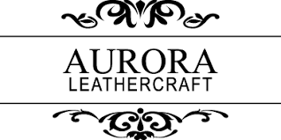
10. Aurora Leather Goods
Why It Works: Minimal design with major luxury appeal. Works beautifully on both large screens and smartphones.
11. ZenTech Laptops
Why It Works: Sparse layouts. Laser-focused copy. A single spotlight image that says it all.
12. AllGood Homewares
Why It Works: Grid-based tips and deals, perfectly tailored for mobile-first readers.

Lead-Nurturing Emails
13. MealJoy
Why It Works: Smart subject line + teaser photo = re-engagement from busy shoppers.
14. FixMyCar
Why It Works: Branded visuals + reminder of USPs = top-of-mind when it matters.

15. Radiance Skincare
Why It Works: A cheeky “You forgot something…” paired with cart images gets clicks and conversions.
16. VidLab Pro
Why It Works: Quiz-driven content gathers insights while nurturing leads—visually striking and super interactive.

17. RunwayFits
Why It Works: Alerting users of price drops on past browsed items—backed with gorgeous product shots.

18. Elevate Electronics
Why It Works: Visual preview of a new site design. Less text, more intrigue.

19. VisionaryTech
Why It Works: Pre-launch hype with minimal copy and a killer hero image.

20. GrowthGram
Why It Works: Trial ending? Features previewed in bullet format to drive subscription renewals.

21. ZenPath App
Why It Works: A calm, positive final CTA. Joyful palette and minimal copy make this a feel-good closer.

Event Promotion Emails
22. Sleepless Symposium by RestWorx
Why It Works: Animated eye icon. Clean agenda. Clear CTA. It sleeps well in inboxes.

23. ImagineNow Design Summit
Why It Works: Speaker photos, bold headers, whitespace galore. A layout that sells the event experience.
24. DesignFWD Countdown
Why It Works: Countdown clock + “Register Free” button = urgency + action. Simple and effective.
Creative Campaign Emails
25. GoodCause Capital
Why It Works: Tight red-and-yellow palette with dynamic visuals. Social proof + clean layout = credibility.

26. Maison Noir
Why It Works: Artistic layout. Saturated color. Jungle leaf detail. Visual storytelling, elevated.

27. Terrace House London
Why It Works: A typographic visual pun turns this standard promotion into a scroll-stopper.

28. HoodieDrop
Why It Works: Single word header. Endless product scroll. Bold, rebellious, unforgettable.
29. ChillSpa
Why It Works: Playful “unsubscribe” email that uses humor to leave the door open.
30. SipSide Wines
Why It Works: Retro graphics + ‘90s lingo = instantly shareable and on-brand for their millennial audience.

31. Brewfolk Roasters
Why It Works: Festive without being cheesy. Gift bundles + cobalt gray and tan = sophistication with seasonal flair.
Time to Level Up Your Email Design Game
Emails are more than just messages—they’re micro-experiences.
With DolFinContent, you'll unlock:
- On-brand, scroll-stopping templates
- Fast-turnaround design
- Human creativity powered by AI tools
- A flexible model built for scaling
Let’s make inboxes work for your brand—not against it.
.png)
.png)
.png)


